Spero Solutions
Bringing a changing business into one clear web presence
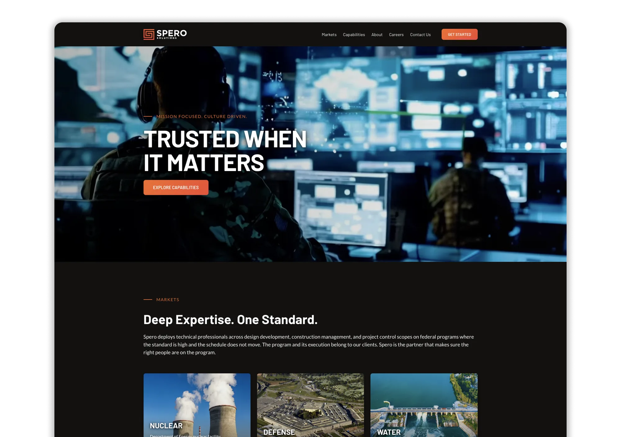
I designed and delivered a consolidated website that aligned Spero’s online presence with how it presents its professional services, government markets, and capabilities in sales conversations.
01. Overview
Three identities, one evolving business
Spero is a professional services organization that augments teams supporting government programs. Its business evolved from a commercial IT focus to supporting a broader range of technical disciplines on government contracts and for the vendors serving those programs.
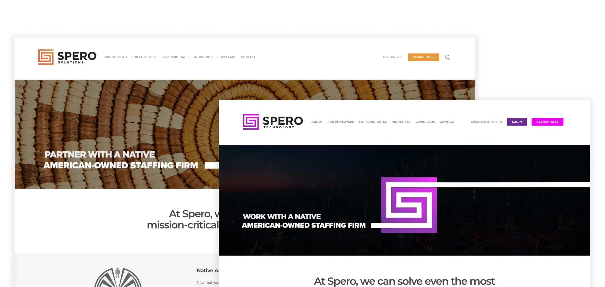
The web presence had not kept pace. Spero operated three versions of the original website, carrying largely the same content under different logos and brand colors. Those identities extended to business cards, website domains, and email addresses. A prospect could receive an orange, blue, or purple business card depending on whom they met. An account manager might email from the Engineering domain, while billing correspondence arrived from the Solutions domain. Each interaction could present a different identity for the same business.
The content created another disconnect. The original Solutions site mentioned government experience, but lacked the specific market, capability, and program context Spero used in sales conversations. A prospect following up online would find little detail connecting those conversations to the teams and programs Spero could support.

02. Sales experience
A website that could support the sales conversation
The website's central job was to give prospects a credible place to follow up after speaking with Spero's sales team. The language online needed to match how Spero already presented itself: the government programs it supported, the markets it served, and the capabilities in which it had relevant experience. Updating the copy and organizing that information into clear pages would help prospects connect the sales conversation with what they found online.
I worked directly with Anthony, Spero's CEO, to define the site hierarchy before exploring the visual design. We separated the markets the company wanted to serve from the project functions its technical professionals could support. We reviewed Actalent, Jacobs, and Amentum as reference points for the language and structures prospects might already encounter among larger firms and potential customers.
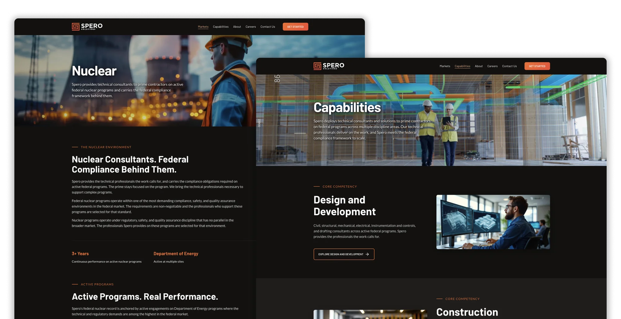
The resulting structure gave markets and capabilities their own paths. When Spero discontinued its IT talent offering, I replaced the homepage’s two delivery categories, Engineering and IT, with three core competencies: Design and Development, Construction Management, and Project Controls. I updated the imagery and aligned the Capabilities page with those same three areas. These labels describe where Spero places technical professionals within client-led programs.
I also brought context from approximately seven to eight conversations with salespeople, recruiters, and leadership during a broader operational-efficiency engagement. Those conversations helped me understand how staff described the business and the tools they used. They were not a dedicated website usability study.
Pan and zoom to explore the sitemap, or expand it to full screen.
03. Visual direction
Turning stakeholder preferences into a visual direction
A marketing agency had helped establish Spero's brand voice, but its website concepts and subsequent revisions had not produced a direction Anthony wanted to pursue. I took over website design and delivery while the client continued to supply the specialized business content.
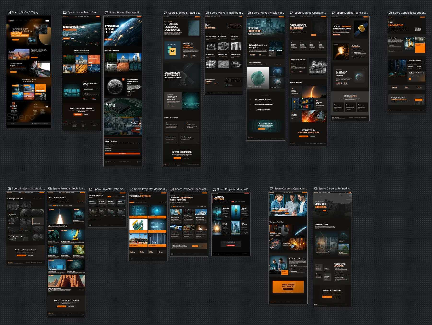
Anthony liked the dark theme of the agency concept, but the page itself did not give us the direction we wanted. I used that concept as a reference in Google Stitch, supplied the Spero logo, and prompted alternatives based on what we disliked and what we wanted to see: prominent imagery, a large hero, and cards that paired images with useful information.
One direction closely matched what he wanted. I used it as a starting point, then developed and refined the designs in Figma for review. This let us discuss specific choices, such as how a header worked or how markets were presented, instead of relying on abstract descriptions.
I created alternatives for filled and outlined cards, button treatments, and interior-page headers.
The resulting design system established typography, background and section colors, buttons, and repeatable page treatments.
Comparing typography in context
I used Claude to create a working HTML comparison of five font pairings using the same sample content. Seeing the fonts against the site's dark palette helped Anthony and the marketing stakeholder make a concrete choice: Barlow for headings and Lato for body text.
Sentence case
Trusted When It Matters
All caps
Trusted When It Matters
Spero deploys technical professionals across design development, construction management, and project control scopes on federal programs where the standard is high and the schedule does not move.
Sentence case
Trusted When It Matters
All caps
Trusted When It Matters
Spero deploys technical professionals across design development, construction management, and project control scopes on federal programs where the standard is high and the schedule does not move.
Sentence case
Trusted When It Matters
All caps
Trusted When It Matters
Spero deploys technical professionals across design development, construction management, and project control scopes on federal programs where the standard is high and the schedule does not move.
Sentence case
Trusted When It Matters
All caps
Trusted When It Matters
Spero deploys technical professionals across design development, construction management, and project control scopes on federal programs where the standard is high and the schedule does not move.
Sentence case
Trusted When It Matters
All caps
Trusted When It Matters
Spero deploys technical professionals across design development, construction management, and project control scopes on federal programs where the standard is high and the schedule does not move.
04. Iteration
Testing visual choices against real content
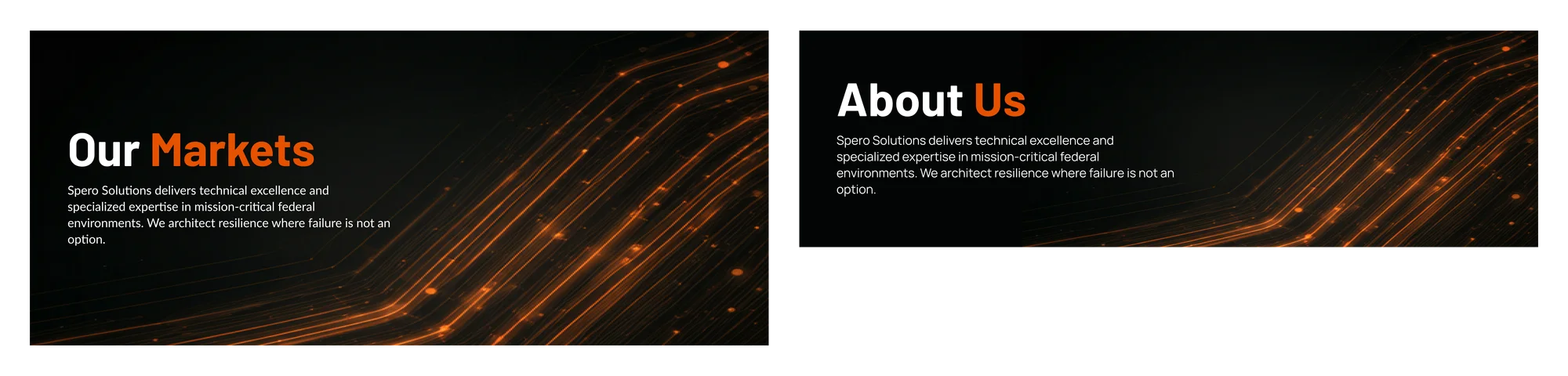
I explored three directions for interior-page headers: an abstract pattern in tall and compact layouts, photography with orange overlays, and photography with a subtle dark gradient. Comparing the options with real imagery helped us evaluate the header height, readability, and use of brand color.
The client chose photography with a subtle dark gradient. It helped the title and supporting text stay readable while preserving the image's natural colors. The orange treatments, both a full overlay and a gradient, sometimes clashed with the selected photography and did not work consistently across the image set.
The comparison reinforced that a header treatment needed to work with the actual content across the site.


05. Development
Building a foundation I could extend
The previous WordPress site was rarely maintained and included unwanted comments, despite having no business need for commenting. I recommended Astro for a largely informational site that did not require the existing CMS workflow. The choice also supported the planned use of reusable templates for future case studies.
I coded the homepage and Markets page, establishing the layout, styling, and shared components. I then used AI to help organize the CSS into reusable variables before extending the site.
For subsequent pages, I created the designs in Figma and directed Anti-Gravity to implement them using the existing project components and styles. I reviewed the results and directed corrections to typography, spacing, and other details. The finished site combined my initial implementation with AI-assisted development under my direction.
Typography
Color Palette
Buttons
Card Component
Defense
DoD military construction programs across USACE, NAVFAC, and AFCEC where the delivery standard does not move.
Learn More →- ContainerSurface #1F1D1C · 1px hairline border (5% white) · 8px radius
- MediaFull-bleed image, fixed aspect, top of card
- HeadingBarlow ExtraBold, uppercase, 20px
- BodyLato Regular, 14.5px / 1.55 line height, dimmed white
- ActionGhost button, 2px orange border, uppercase label + arrow
- ReuseSame shell powers market cards, capability cards, and case-study tiles
06. Launch and reflection
Launch and reflection
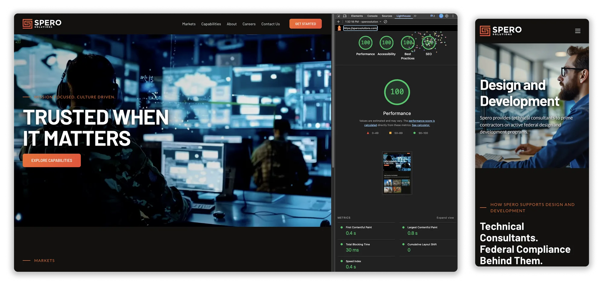
I coordinated the domain redirects and DNS cutover to Netlify. During launch preparation, I used Lighthouse reports to identify issues and directed fixes with AI assistance.
The delivered result was one consolidated website positioning Spero as a professional services partner for team augmentation on government programs. Its market and capability structure replaced three overlapping presentations of the business and gave project leaders a clearer view of the technical talent Spero could provide. A homepage Lighthouse run captured on September 17, 2026 scored 100 in Performance, Accessibility, Best Practices, and SEO.
The strongest lesson was to establish content readiness and disclosure review earlier. For a similar project, I would set clearer checkpoints for final copy and imagery, and have the client confirm that project-specific claims and visuals were approved for public use before building them into pages.
The work also reinforced the value of making decisions visible. Concrete layouts, font comparisons, and implemented pages helped stakeholders give useful feedback. A reusable design and code foundation then made it possible to carry those decisions across the site as the business changed.