WearLog
Turning daily watch wear into a collection journal
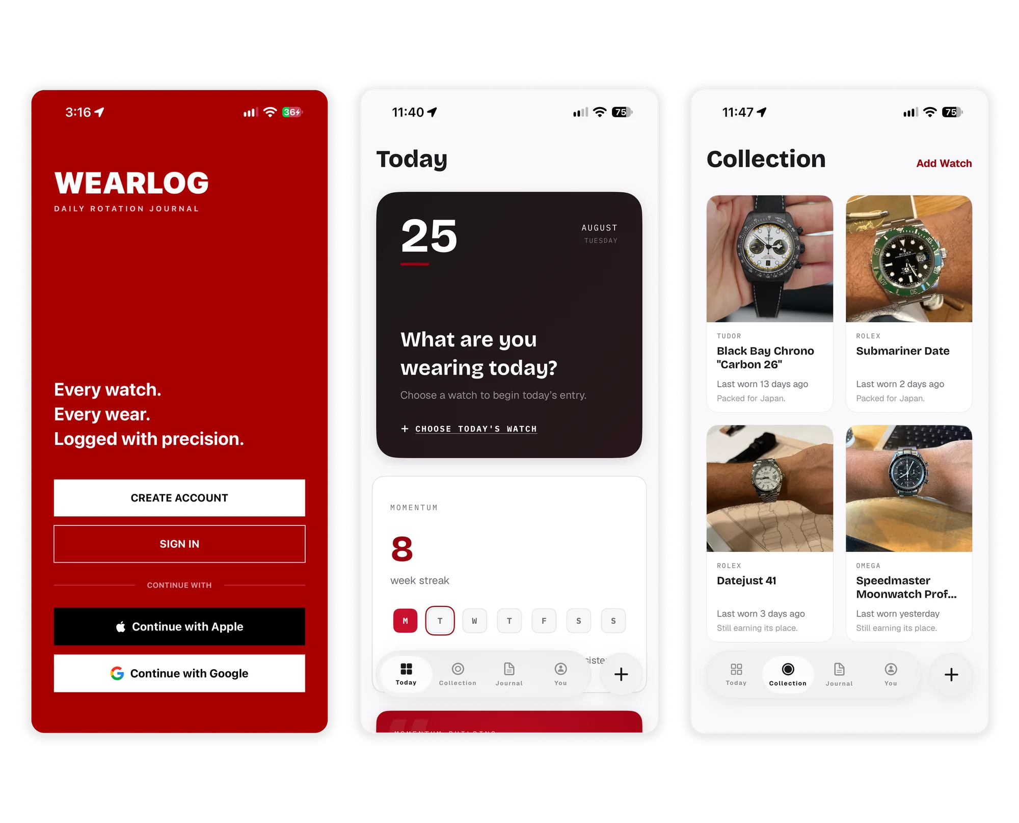
I am designing and building WearLog, a personal iOS project that helps watch collectors log what they wear and build a history of their collection. Real-world use and an AI-assisted workflow are shaping the app as I prepare it for launch.
01. The idea
A watch collection, one day at a time
As a watch enthusiast and collector, I wanted a way to remember what I wore and see how my collection changed in use over time. I had seen collectors on Reddit tracking wears in spreadsheets, but I did not have a tracking habit myself.
I started WearLog in May 2026 as a personal side project: an opportunity to develop my UX design skills, explore working with AI, and take an iOS app from an idea toward my first independent App Store release. The core interaction was simple: choose the watch you are wearing today, optionally add a photo, and save the entry.
Over time, I wanted that history to help collectors notice favorites and overlooked watches. Streaks, milestones, and learning about watches could make the experience enjoyable enough to return to. Those ambitions gave me a direction, but I needed a smaller version I could actually use.
02. First version
Two watches and a trip to Japan
An upcoming trip to Japan gave the first version a concrete purpose. I manually added the two watches I would take and focused the build on logging a wear, seeing it on a basic calendar, and viewing photos associated with each watch. This version stored the entries locally. Syncing came after I returned.
I usually logged when we sat down for breakfast or reached our first destination. At Shibuya Sky, I took a photo at the top. Notes let me record places such as the Arashiyama Bamboo Forest alongside the watch I wore that day.
Pair an original trip photo with its saved wear entry and note. Use the Japan build if retained; identify any later screen showing the original entry.
Using the app this way gave the entries a personal dimension. A wear log could become a reminder of a place and a moment, as well as a count. It also gave me a working product to test in everyday situations.
03. Interaction design
Making the history understandable
My original concept used a GitHub-style contribution graph to show several months of activity. Each watch brand would have a color, filling the grid as I logged wears. I liked the compact view and the sense of progress, drawing on the activity rings and streaks I enjoyed in Apple Watch and Peloton.
When I showed the concept to my wife, who also collects watches, she did not understand what she was looking at. The pattern was familiar to me through my work, but that familiarity did not carry over to her.
I replaced the contribution graph with a calendar that highlights days with logged wears. When a day includes watches from different brands, its circular marker splits into their corresponding colors. This was a direction change prompted by one informal feedback session. Broader collector testing is still ahead.
Compare the original graph concept with the implemented calendar. Annotate the date structure and the split marker for a day with two brands.
04. Daily logging
Keeping the entry simple and the habit intentional
From the home screen, logging opens a sheet where someone chooses a watch from their collection. They can take a photo, select one from their library, add a note, or include an optional city and country after granting location permission. Only the watch selection is required to save an entry.
Show the home prompt, watch selection, optional photo and notes, and saved entry. Include the short path that saves without a photo.
WearLog supports more than one watch in a day, but I deliberately limited logging to the current day. I wanted a conscious daily check-in, with the possibility of missing a day and starting again. Peloton influenced how I thought about that balance between maintaining a streak and accepting an imperfect record.
Optional: pair a focused Peloton screenshot you used as a reference with the related WearLog screen. Annotate the specific streak or progress pattern and how you adapted it for watch logging.
That choice comes with a tradeoff: someone who wore a watch but forgot to log it cannot complete their history later. Whether that constraint encourages a useful ritual or creates unnecessary frustration is something I want to learn from other collectors.
In my own use, seeing wear counts and anticipating future milestones encouraged me to rotate watches. I began wearing my Datejust more often to add to its history. That is an early personal observation, with badges still in development.
05. AI collaboration
Directing the work from concept to implementation
I began by talking through the concept with Gemini, then used it to organize the ideas into epics and user stories. I brought that backlog into Claude to explore branding and initial screens, using references from Peloton and Instagram to explain the tracking and photo-journal experiences I had in mind.
I reviewed those explorations and iterated on what belonged on each screen. The resulting designs gave me a starting point for implementation with Antigravity. I owned the product direction, priorities, interface decisions, and testing, while AI helped generate designs and code.
Show one retained Claude exploration, the implemented screen, and a revision you directed. Call out a specific change to hierarchy or content.
As the app grew, I used ChatGPT to help prioritize the backlog, prepare implementation prompts, and review Antigravity's proposed and completed work. I reviewed and revised those prompts before passing them along. When a layout overlapped or an implementation stalled, sharing the Swift code and a screenshot with another model sometimes helped identify the issue.
The reviews also surfaced cases I had not initially considered, such as deleting an entry without an internet connection and later syncing. My own testing caught other problems, including a feature-image change that made previous wear photos disappear from the interface and needed to be fixed. The workflow depended on reviewing the output and using the app, then feeding those findings back into the next iteration.
06. Data and design
Letting real watch data shape the interface
After Japan, I added syncing through Supabase and expanded the collection flow so people could add watches. I worked with Claude on a research skill to assemble a catalog spanning Panerai, IWC, Rolex, Omega, and Tudor. Adding a watch draws from that stored catalog instead of fetching its details from an external watch API each time.
The actual data exposed a design problem. Manufacturer descriptions for materials, dial colors, and bracelets were more specific than the standardized categories in the forms. A watch could display a named bracelet while the dropdown offered only the broader category of bracelet. Selecting that category could overwrite the more detailed description.
Capture the current field value and its open dropdown so the mismatch is visible. Reserve an adjacent view for the redesigned form that preserves manufacturer detail alongside a standard category.
The search results had a related issue. Material, dial, and strap details appeared in different positions across cards, making closely related references hard to compare. Colored chips added visual separation, but did not resolve the inconsistent arrangement of the information.
Capture several current results from the same watch family. Mark the shifting positions of material, dial, and strap details. Compare with the same results after the card redesign.
My redesign needs to preserve the manufacturer's description alongside a standardized category and make their relationship clear. If I started again, I would inspect representative watch data earlier. Understanding its variations would have helped me define the fields, editing behavior, and card hierarchy before building the screens.
I am considering a web portal connected to the Supabase catalog so I can inspect watch data, define standardization rules, and see how proposed changes affect the records. It would also help me review where a separate field is needed to preserve manufacturer terminology. This is planned work, intended to make the relationship between the data and the app easier to understand.
When a portal prototype exists, show an original manufacturer value, its standard category, the proposed rule, and a preview of affected records.
07. Refinement
Giving each part of the screen a clear purpose
Using the current app has also helped me identify where the initial AI-generated layouts need more design work. The home screen repeats the weekly streak in two cards, and the main progress card uses more space than the information requires. Collection cards are taller than they need to be and include generic copy that does little to explain a watch's history.
Capture the current home screen with both weekly streak cards visible. Pair it with the revised home screen and annotate what was removed, condensed, or given a distinct purpose.
I want to condense those cards, remove repeated information, and make the most useful details easier to scan. The watch milestone treatment feels promising because it connects today's entry to the next wear-count target. Each card should contribute something distinct to the experience.
Compare one current collection card with its redesigned version using the same watch. Highlight the information retained, removed, and reordered, with a list excerpt to show the effect on browsing.
Making the right watch easier to find is another priority. I am exploring nickname and more forgiving search, as well as scanning a warranty card for its reference number. These are potential improvements to the add-watch flow, not implemented capabilities.
Record a search for Starbucks and show the actual result. Once nickname search is implemented, repeat the same query to show whether the relevant watch can be found. A misspelled model name can provide a second test.
08. Current outcome
A working app, with launch still ahead
As of September 2026, WearLog is a working, pre-launch iOS app with collection management, daily wear logging, photos and notes, calendar history, streaks, and Supabase syncing. I have used it myself and gathered informal feedback from my wife. The experience still needs visual refinement and feedback from a broader group of collectors.
Badges, cost per wear, richer trend analysis, and watch education remain future work. I am also interested in a map of where watches have traveled and, eventually, a social experience built around shared activity and trends.
The first release will be successful if a small group of collectors uses WearLog, returns to log wears, and gives me feedback about what is useful and what gets in the way. Reaching the App Store would also complete a personal goal: carrying a product from an initial idea to an independent iOS launch.
So far, the most valuable learning has come from putting the app, its data, and its design assumptions into use. The calendar changed after feedback. The catalog exposed weaknesses in the forms. My own entries revealed both bugs and reasons to keep logging. Those observations are shaping the product I am preparing to release.